A business card is often the smallest piece of marketing a freelancer creates — yet it carries a huge amount of pressure. In three seconds, it has to say who you are, what you do, and why it’s worth remembering. For solopreneurs, minimalism isn’t just a trend; it’s a survival strategy. Clean layouts photograph well, print cheaply, and age gracefully as your brand grows.
Why Minimalism Works for Independent Professionals
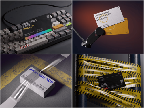
Freelancers rarely have a design team behind them. A stripped-down card with generous white space, one accent color, and clear typography looks intentional rather than unfinished. It also photographs beautifully in a Business card mockup, which matters when your card lives mostly on Instagram, Behance, or a portfolio site before it ever reaches a real hand.
Creative Minimalist Mockup Ideas
Here are a few directions worth testing before you commit to print:
- Monochrome on textured paper — a single typeface, one line of contact info, shown on kraft or cotton stock for tactile warmth.
- Negative-space logos — let the card’s blank area do the branding work, presented at a slight angle to show depth.
- Duotone gradients — two soft tones instead of a flat color, useful for creative freelancers like photographers or illustrators.
- Embossed initials — subtle texture without extra ink, great for consultants who want a “quiet luxury” feel.
- Vertical orientation — a small shift from the standard horizontal format instantly makes a card feel more considered.
Real-Life Use Cases
Consider a freelance copywriter pitching a rebrand: instead of printing ten variations to compare, she drops her design into a few scenes and instantly sees how a card looks on a wooden desk versus held between two fingers. A UX designer applying for contract work uses a similar approach — placing his card mockup on a Behance case study so recruiters see the physical product without waiting for a print run.
A photographer duo launching a wedding studio uses mockups to test two color palettes with actual couples before ordering 500 cards. A solo bookkeeper, meanwhile, keeps things simple: one clean mockup on a marble surface for her website’s “Contact” page, reinforcing trust before a client ever emails her.
A freelance illustrator preparing a conference booth takes it further, staging her card mockup alongside a sketchbook and pen to hint at her process before anyone even sees her portfolio. In each case, the mockup isn’t decoration — it’s a decision-making tool that saves money and avoids printing regret.
Five More Minimalist Directions to Try
If the first batch felt too safe, these push the concept a little further without breaking the minimalist rule:
- Single-line contour icons — one thin-line symbol replacing a logo entirely, paired with tight kerning.
- Ultra-thin borders — a hairline frame around the card edge to add structure without clutter.
- Muted pastel backgrounds — off-white, sage, or blush tones instead of stark white for a softer first impression.
- Typography-only layouts — no icons or graphics at all, just carefully weighted type doing all the work.
- Foil-effect accents — a small metallic detail on an otherwise flat design, shown at an angle to catch light realistically.
Business Card Mockups on ls.graphics
The mockups from ls.graphics stand out for their premium quality and ultra-realistic rendering — shadows, paper grain, and lighting all feel physical. Files come with organized layers, so swapping a logo takes seconds, and each set offers many different angles and color styles within stylish, minimalistic compositions. The Edit Online feature lets you preview changes instantly in the browser, no software required. There’s also a solid library of free scenes to try before buying, ideal for freelancers testing ideas on a tight budget.
Conclusion
Minimalism gives freelancers and solopreneurs a business card that looks polished without looking expensive to make. The real work, though, happens before printing — in how the design is tested, refined, and presented. Tools like the ones on ls.graphics make that testing phase faster and far more convincing, turning a simple flat design into something clients can practically feel before it ever reaches their hands.